Mind Relief
Stress relief for competitive gamers.

Part One: Research
Problem
We felt there was a need for this product first and foremost because we are gamers and just from our experience we see all of the negative things that go on in the gaming scene. After interviewing various people about this subject matter all of the participants stated that they encountered someone who was being negative or acting poorly during a competitive game. In our opinion Mind Relief needed to be created so that we could try and solve the issue of toxicity in gaming. While we are fully aware that people will always act negatively, if we create a product where a player can go when they are angry or stressed and relieve those feelings in a constructive way then we know that our job has been completed.
Secondary Research
Secondary research is what we started with to get a general idea about the subject . While researching we focused on answering this main question:
Why are players experiencing bad or negative behavior in these games ?
The answers that we found was nothing out of the ordinary but it assured us why people are experiencing this behavior.
For starters basically anywhere you look online you will see that toxicity or negative behavior is in every multiplayer game but why is that ?
Competitive games really rely on teamwork and strategy to win and when someone on your team is not at the same skill level as you or there is not enough communication then problems begin to arise. Your team isn’t coordinated and you could start losing rounds or lose the game entirely.
Losing games consistently causes a players competitive ranking to drop and this can aggravate players especially when it might not be their fault. For example if it is the last round of a game and the only person who is alive on your team is a random player your win or loss is entirely in their hands. Having that unpredictability is very nerve racking and your entire game performance comes down to that 1 person.
This is of course 1 example but some other problems could be: the game not functioning as intended, the game has some sort of bug or glitch, the skill based match making putting players into games that maybe to hard or to easy for them. There are a number of issues that are entirely out of the players control.
While there has been some implementations to combat people having bad behavior such as the ability to mute players it still is not enough because as mentioned above your competitive ranking can still be affected by things out of the players hands.
Interviews & Survey
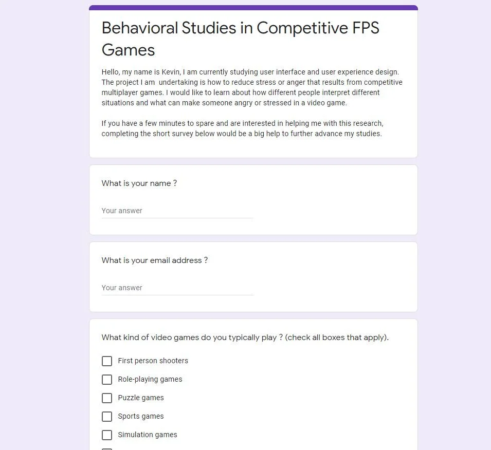
Interviews gave us a better understanding of what people who play competitive FPS games experience first hand. To gather our participants we sent out a screener survey so that we could get the people who were the best candidates . This survey asked participants what kind of games they played, how much they played, and if they ever experienced stress or saw someone who was experiencing stress or anger in these games.
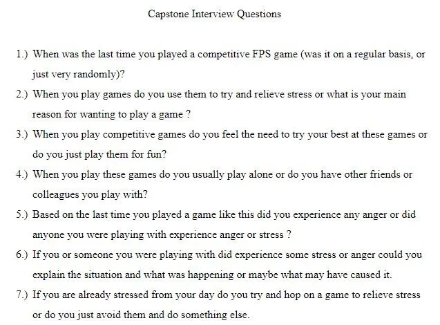
Once the right candidates were acquired it was time to to hold the interviews. The questions we asked were very basic and gave us mostly information that we had already but one of the candidates had a very interesting suggestion. This participant was talking about how professional sports players have coaches that can teach them about how not to get angry or to use that anger to get even better at their sport. After hearing that idea it really stuck with us.
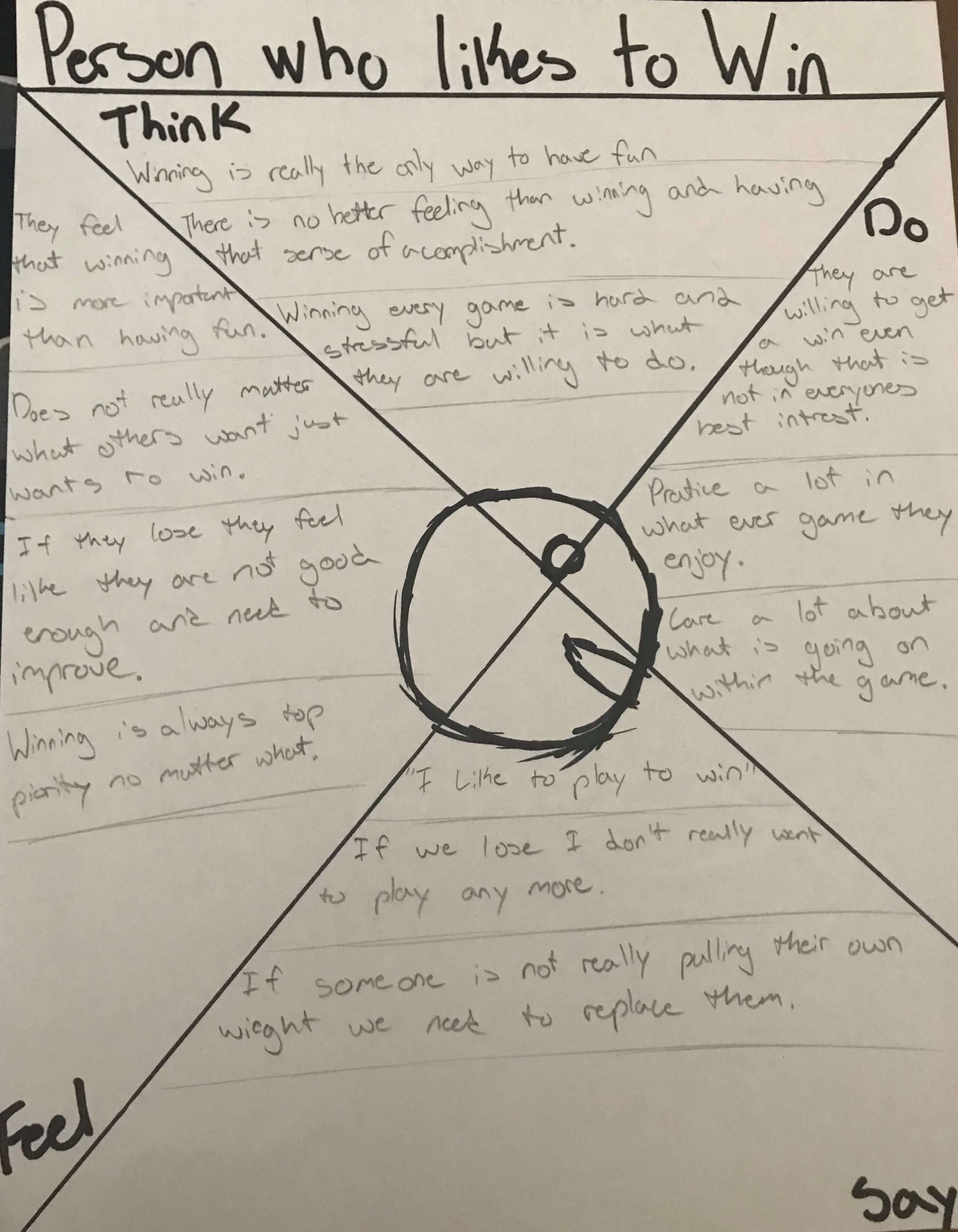
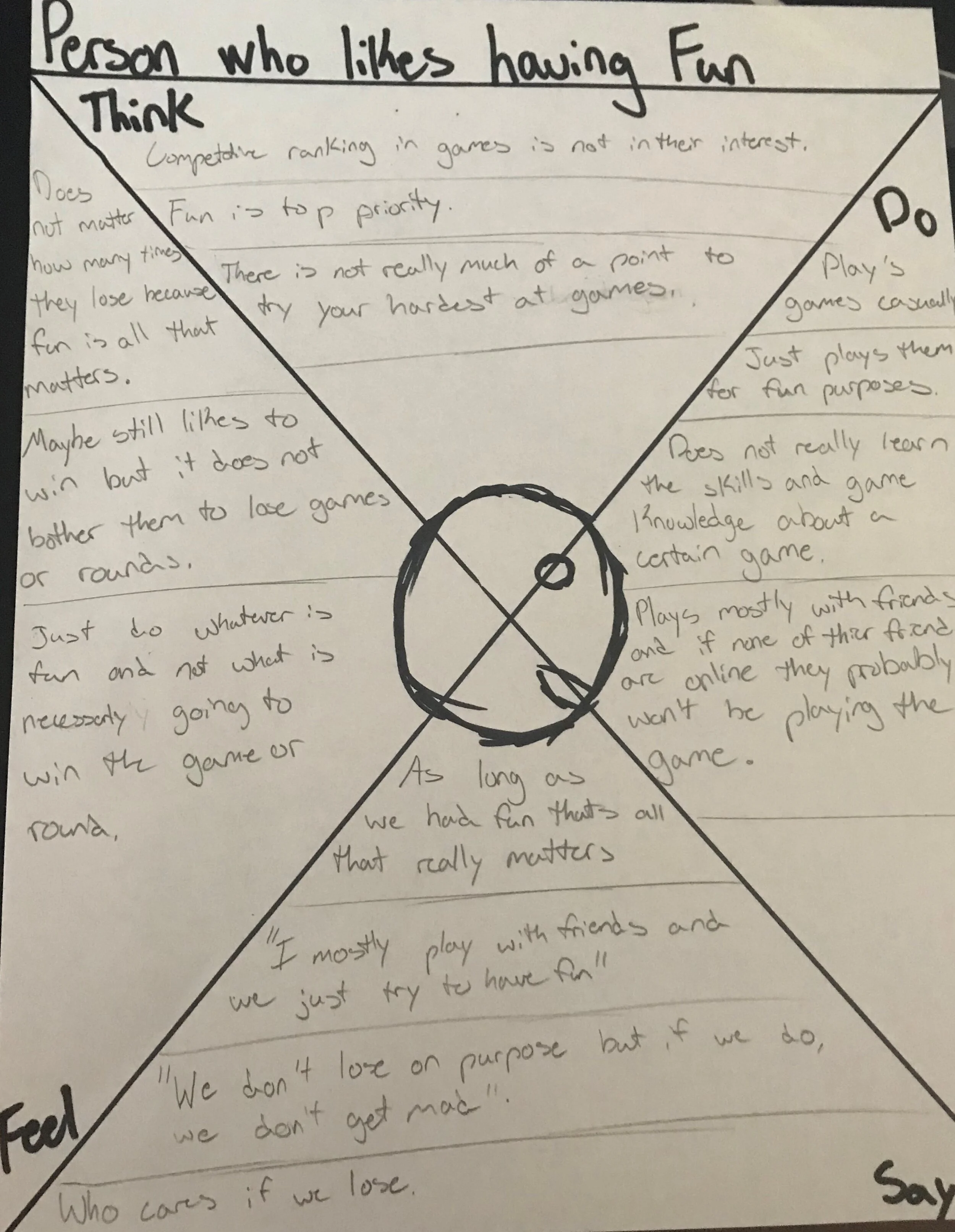
Empathy Maps
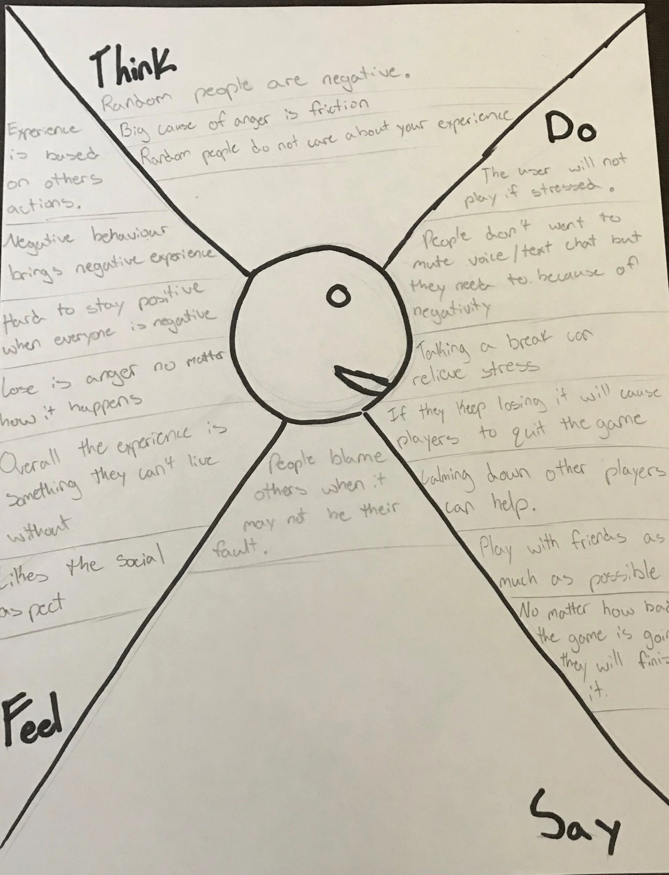
We created 3 empathy maps for this project. Empathy maps are made to show what a user thinks, does, feels and says about any given situation. The first empathy map was for someone who plays competitive games to win and does not care about anything else, the second was for a user who plays competitive games but does it very casually or for fun and the last one was for what we thought our “typical user” would be.
Personas
A persona takes the information from empathy maps and transforms it into a potential user of the product. You will see that every empathy map was formed into a persona to represent what a user could think about the product.
How Might We Questions
These are questions that we as a designer ask when someone will interact with a design or feature. You start the questions with “How might we” then add the rest of the question. They can be as complicated or simple as you would like. These are the HMW questions we created for this project.
1.) How might we alleviate stress and anger that people experience while playing multiplayer competitive fps games ?
2.) How might we stop others from acting negatively if things are not going their way so it does not influence other peoples outlook on the experience ?
3.) How might we stop people from associating these games with a stressful environment ?
Research Summary
We need to figure out ways to stop players from feeling stressed or angry when playing competitive games but that is way easier said than done. While some solutions have been implemented such as the ability to mute players or even kick players that are acting negatively there is more work that needs to be done. Doing this research has been very interesting and has really shown this issue from different view points.

Part Two: Information Architecture
Minimum Viable Product
We will create a website that can help coach people, while playing competitive games, to eliminate stressful experiences that could take place in these games. This will be accomplished by having multiple stress relief methods, reminding players to take breaks if they are continuously losing and we want to promote an overall positive aesthetic to help people feel more comfortable.
User Stories
User stories put you in the shoes of a potential user and ask how can you perform an action and what does that action achieve.
There will be multiple stress relief methods available to the user at all times. These will include:
Articles
Mini Games
Meditation Exercises
Imagery
There will be reminders given to players to take breaks often if they are continuously losing. These would be defined as:
Losing X out of Y games would trigger a voluntary time out prompt
After 0:00 amount of time, a voluntary time out prompt will display
An overall positive aesthetic to the site would help people feel more comfortable. This will include:
A simple but effective design
Easy to navigate
No information overload
A neutral color palette with pops of color to add contrast
Site Map
A site map shows each page and subpage on a website. For example with the site map that we created for Mind Relief you can see that a user first opens the program, logs into their account, then is taken to the dashboard home page. From here the user can decide where they would like to go and what page they would like to open.
User Flows
User flows are then created based off of the sitemap to describe how a user will navigate to any page. A red route is the way in theory every user would navigate to a critical page in your website. The red route needs to be very refined because a user will use this path the most. Below you will see 2 user flows for 2 red routes.
Flow 1 is how a user would navigate the site to reach the stress relief page.
Flow 2 is how a user would review their uploaded gameplay on the website.
Sketches
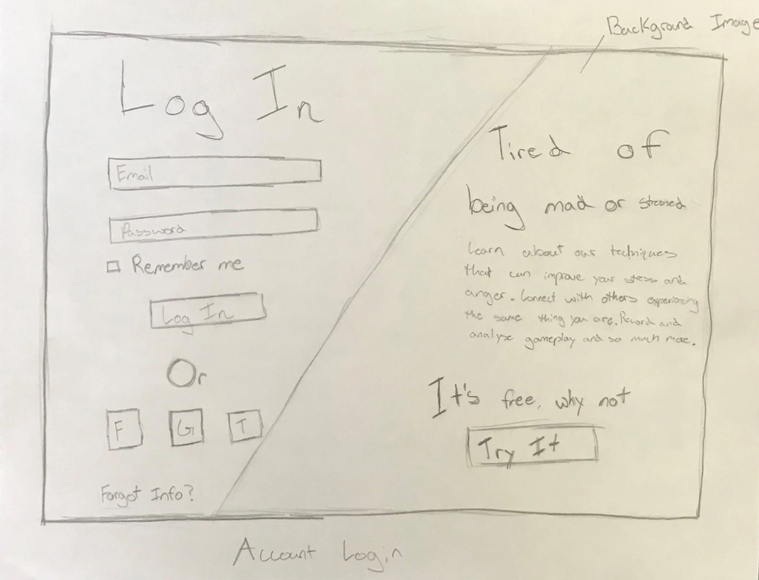
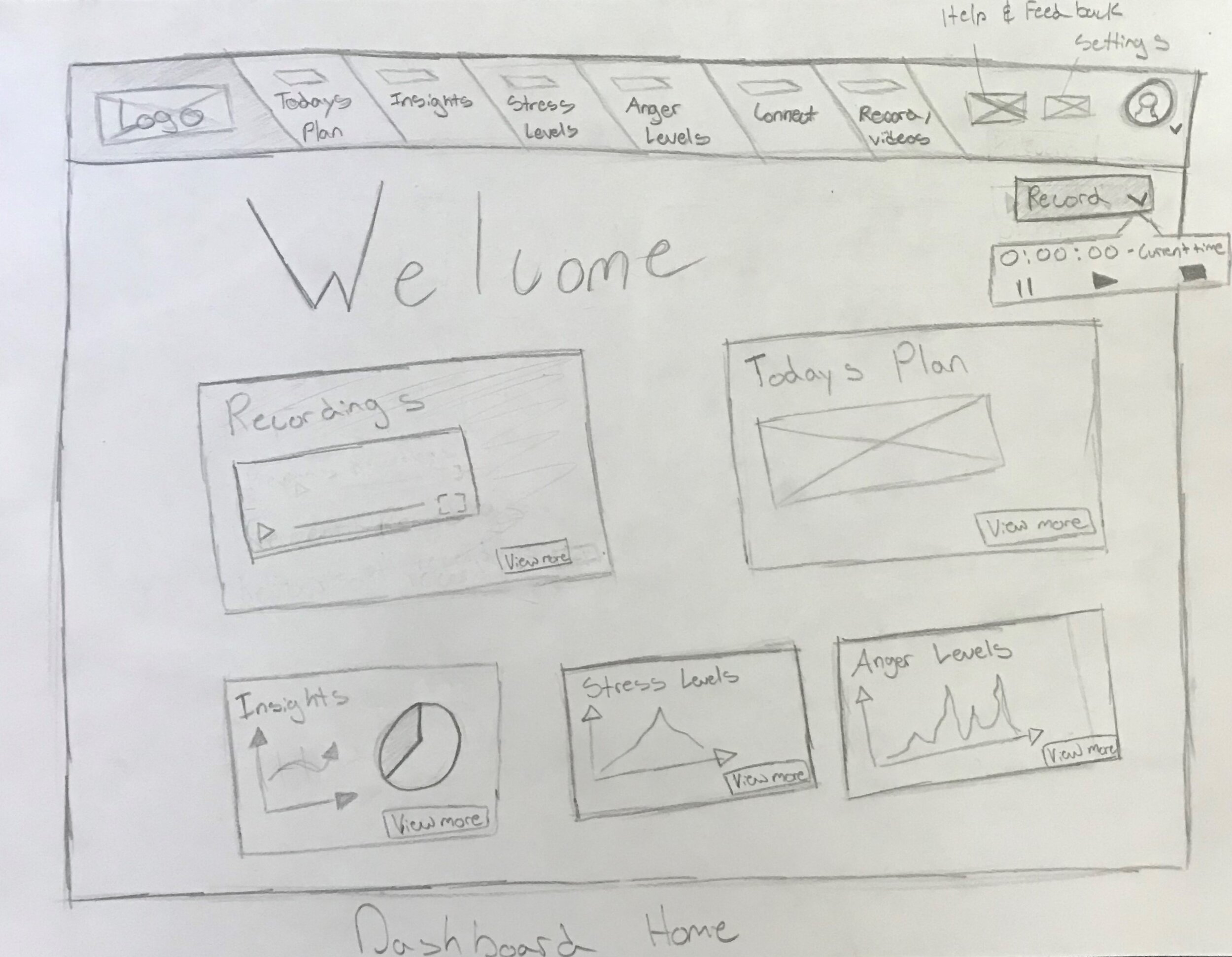
Once we have established how the actual website will flow from page to page it is time to sketch how the site will look and function. Sketching is very important because it allows designers to get their ideas out very roughly and quickly. If you jump straight into making high quality designs it could cost you valuable time and money if you want to cut features or adjust how something works.
Picture 1 is a sketch of the login page.
Picture 2 is a sketch of the dashboard.
Wire Frames
While wire framing is a little bit more high fidelity than sketching it is still important not to put too much detail into it because you can still change major features and flows. Wire framing essentially determines how the website will look.
Wire Flows
Wire flows are constructed from wire frames and they show how a user would move through the wire frames. Arrows are added on top of the initial wire framing to represent a user clicking on a part of the website.

Part Three: Styling and Testing
Style Guide
A style guide is a template that someone can reference when building a website to see the general theme of the site. The style guide that we created for Mind Relief can be seen below:
A logo that includes its size, padding and how it is used
A color palette for primary, secondary and accent colors
Fonts that are applied to the header, body, and title text
Grids that show the edges of the content area
Icons that you must use for things like the settings button or profile button
UI elements such as a text field or a button
The brand platform that shows what the company represents
A mood board which adds some pictures to help illustrate the brand platform
Lastly images that describe the site just so you can get a general feel for the site
High Fidelity Mockups
Staying true to the style guide we created the first mockups. Starting with the wire frames as a base they were iterated upon until we got a design that looked appealing. While this design is almost final it still needs to be tested and changes need to be made so that it can be considered done.
User Testing Plan
Testing the high fidelity designs allows us to see if there are any major problems with the design. The testing plan that we used for Mind Relief can be seen down below.
Participants will be read an intro to the project and what we are testing.
Tasks we will conduct:
1.) Can a user navigate to the “Stress Relief” page effortlessly ?
2.) Can a user navigate to the “All Videos” page effortlessly ?
3.) Is the in game pop up noticeable enough that a player will not glance over it ?
Final thoughts about the project can be shared and if the participant had any other questions they can also be asked at this point.
User Testing Results
The tests that we conducted were all online and moderated by me to make sure each participant knew what to do and was able to ask questions if needed. From the testing no one really had any problems navigating the site and all of the feedback was great. Any changes that people reported were all very tiny fixes that can be easily applied. I spoke with and tested 5 participants. These participants were recruited by simply asking if they would like to test my design for the website so that I can better the experience and who ever agreed to that I tested.
Summary of testing results:
When asked to navigate through the site no one had any issues.
No one mentioned anything being hard to read or the text being confusing.
Everyone said the colors work well.
The only “problems” people had were to just add a few very minor changes such as making the logo on the website page clickable, or adding some pictures.
Changes Made
We concluded from the first round of testing that no major problems were reported with usability so conducting a second round of testing was not necessary. Instead we fixed all of the cosmetic issues that were reported.
Fix 1:
The logo on the webpage did not have any actions. To fix this issue we made it so that when you click the logo it takes the user to the sign in page.
Fix 2:
Since we could not decide whether to make the boxes on the dashboard bigger or smaller, we kept them the same size. It seemed like the vast majority liked how the spacing was on the dashboard so it was kept.
Fix 3:
The dashboard however did lack variety on the home page. To fix this issue we added pictures, videos, and graphs to make the overall appearance seem much more diverse.
Fix 4:
The navigation bar at the top would not follow the user as they were moving through the site. To fix this issue we anchored it to the top of the web page.
Final Designs
After all of the necessary changes were made we updated our designs and came up with these final designs.
Conclusion
What we came up with in the end was a program that allows its users to upload, review and iterate on their gameplay as well as having multiple stress relief methods to teach our users how to constructively get rid of stress and anger that can result from playing competitive FPS games. This project has been an amazing learning experience and I am extremely proud of what we were able to achieve.
